

I was struck by Soapbox’s work with the Stockholm Environment Institute (SEI) to modernise their communications.+ As I watched the new brand design take shape in a series of short animations and print pieces, it occurred to me that Soapbox had gone beyond the usual brief.
It is not just about impact
John Schwartz summarises the role of think tank brands in the following way. They:
- Help them become the organisations they aspire to be.
- Help them own a piece of intellectual and cultural territory.
- Help them produce the right kinds of communications for the right audiences.
Two and three suggest a purpose. Think tanks would want to claim a territory to have an impact, and they produce the right kinds of communications for the same reason.
John’s first stated purpose, however, suggests a different objective for a think tank’s communication efforts.
In my mind, the work Soapbox has done with SEI -and the work they did for us– goes beyond the, arguably, mundane world of ‘impact’. Most organisations can design an effective policy brief. Social media campaigns are a dime a dozen. Digital services like WordPress, MailChimp and YouTube make it possible for think tanks to produce friendly and accesible websites, send out professional looking newsletters and distribute their videos widely. All these tools help think tanks produce better communications- and help their research reach a wider audience. These efforts should, by design, result in greater impact. But do these tools help them become the organisations they aspire to be?
This is where a brand (and the branding effort) comes in. A brand is more than just a pretty logo. There is meaning behind it- a sense of purpose- and this is carried throughout every piece produced under that brand. Michael Bierut, design partner of iconic design studio Pentagram, says a logo or symbol is really just a starting point and, as designer Paul Rand said, “A good logo has the pleasure of recognition and the promise of meaning.”
It is also about worth
Watch this video:
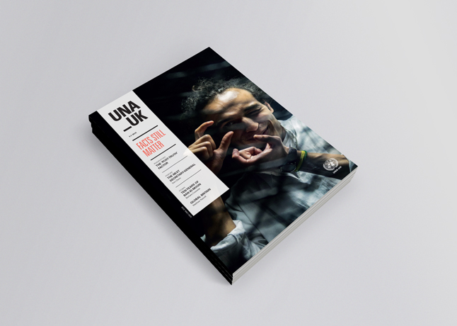
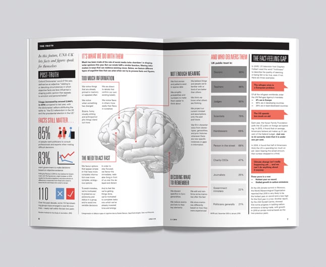
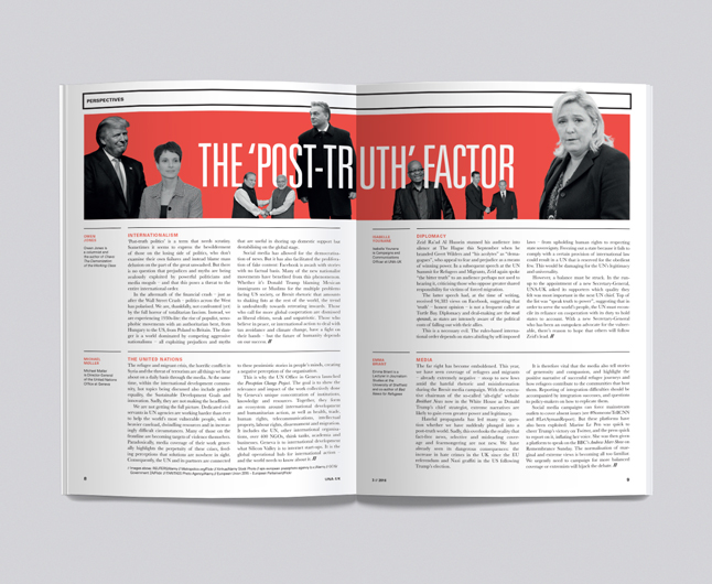
Have a look at the design of the United Nations Association – UK magazine:
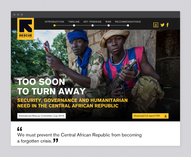
Or explore this media-rich online summary developed to promote a flagship report:
What I see here is communications serving less a utilitarian function and more a teleological logic: the best ideas deserve the best communication (or, the best communication is reserved for the best ideas).
When I see these films, when I hold these publications and when I browse through these websites I experience a sense of respect for the effort that must have gone into generating the knowledge and ideas they convey. Their design is not a distraction nor is it a tool for impact, as some have become accustomed to argue, but rather a sign of respect and indication that what I am watching, holding or browsing is valuable.
The flip-side: if no effort is made to communicate it well, then it must not be worth that much.
Seeing these outputs I am aware that they do not come cheap (although they are not as prohibitively expensive as some would suggest). But I am also surprised at how many researchers refuse to allow their research (and the knowledge and ideas they generate) to be given this kind of treatment, especially when it’s within their organisation’s capabilities. What’s at stake? Is there a preconception that a ‘beautified’ report will distract from its content? Yes, there is design for design’s sake. But there is also design with purpose- and this includes branding, editorial, interactive, print, exhibition design, etc.
Good design will consider the intention of the research, its audience and expected impact, and the best platform to showcase it. The best design will feed from its content and put it in its best light. Isn’t this the respect that research deserves?