The other week I had the good fortune of participating in an excellent meeting in Prague hosted by the Open Society Foundations: Policy Research, Technology and Advocacy Event @ the Hub. The event was designed to bring experts together from across Central and Eastern European think tanks to share ideas and learn from each other on innovative approaches to evidence-based advocacy and communications.
The event itself spanned a number of topics — with the Deputy Director of GoogleIdeas kicking us off with some inspiring examples (I particularly liked the ‘Digital Attacks Map‘) of what can be achieved with a little imagination, a lot of data, and the ability to visualise and interpret it. My favourite anecdote from the key note was on mapping schools in Kenya. Although the government had a list of elementary schools and where they thought they were, they didn’t necessarily know their exact locations let alone what condition they were in. Instead of sending a team of geographers out to investigate — a time and resource intensive process to say the least — they had the clever idea of holding a national ‘photograph your school’ competition. Using the GPS data encoded in those digital photos submitted to the competition they were able to track down around 98% of the schools on the government record. It meant they were able to focus investigations on the two per cent that whose status was unknown rather than having to visit each and every school in Kenya. An excellent story to remind us of the power of the crowds.
While the event wasn’t focused entirely on visualising and communicating data, it was certainly a strong theme throughout. It was fascinating to hear from investigative journalists who not only were tracking down cases of corruption, but trying to figure out ways showing the relationships and geographies between the various actors. They even created their own online visualisation software to help – Visual Investigative Scenarios – which is well worth checking out.
Kristie Evenson and Mareike van Dijk presented an overview of an evaluation they did of a Think Tank Fund project that worked with some 15 Central and Eastern European think tanks to develop elaborate data visualisations. They helpfully summarised the lessons from these six-month projects into Tweet-length soundbites, and they’re relevant to many tech-heavy projects. A few of my favourites:
- ‘Getting to the tip of the iceberg is a climb!’ So much work goes into obtaining data, cleaning data, structuring data that is often not as considered as the end product. But the visualisation — the user interface — is just the tip of the iceberg. Don’t forget to plan for all the other bits too!
- ‘Envisioning the product and usage’ Many of the visualisations had a decent understanding of what they wanted to convey, but not a clear enough understanding of who might use the visualisations in practice or how. Always keep the end user in mind!
- ‘More is sometimes too much’ After the visualisations were developed, there weren’t clear plans in place for maintaining them. A lot of the smaller think tanks felt swamped just doing that — let alone updating them or creating new visualisations. Ensure that sustainability is considered when developing these projects.
There were also a number of hands on how-to sessions. Lucy Chambers of the Open Knowledge Foundation‘s School of Data gave a great overview of some of the online tools available for people interested in working with data. She’s summarised her session in a School of Data blog, in case you want to know, for example, how to pull data from pesky PDF files…
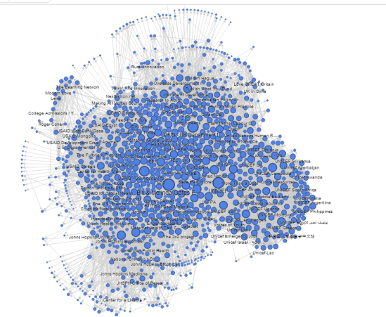
I also attended a session by Josef Slerka on social network mapping. We focused on creating netmap by scraping information from Facebook using Netvizz. They allow for mapping of up to two hops from any Facebook page (the one pictured here starts from a page I manage focused on health and international devlepment).

You can also create a map of your own personal network (I did that too, interesting to see the relationships!). Netvizz produces a GDF file designed to be integrated with the network mapping programme Gephi (open source and free to download – but if you’ve upgraded to Mavericks on your Mac be sure to re-install Java first). But it effectively creates a CSV file (comma delimited), which I imported into Excel, tidied with the vlookup function, and then imported into GoogleFusionTables (which are massively powerful!!!) to make this interactive version that can be embedded anywhere on the web. You can see the full Fusion Table to see what this looks like (it also allows you to filter the nodes to explore specific relationships).
But for all those interesting and complex visualisations, when it came my turn for the dinner speech, my point was clear: a pen and a cantaloupe may be enough. Some of you may remember that at the beginning of the Data Visualisation Competition, Enrique authored a post on ‘a pen and paper may be good enough‘. Well, I didn’t have that luxury at the dinner. I was asked to present about data visualisation without the use of visuals, like PowerPoint or Prezi. But I didn’t think I could do this without some sort of visual aid. So I thought I’d improvise and use some everyday items to help get my ideas across.

Between apples and oranges, pint glasses as bar charts, Christmas tinsel, a few plastic plates, an apple corer and a cantaloupe cum globe, I’m pretty sure I showed that data visualisation doesn’t have to be high-tech to be highly effective. A few of my key points included:
- Don’t re-invent the wheel: As this blog and the datavis competition mini website have shown, there are SO MANY free-to-use resources out there to help make visualisations. Don’t start designing something from scratch unless you’re quite sure that it hasn’t been done at all before.
- Tell a story: Telling a story starts with data, of course, but a good story has one eye on the data and one eye on the bigger picture – that’s your analysis. And don’t forget a title can help tell the story.
- Make it accurate: Do choose the right type of visual to tell your story. And once you do that, make sure you’re not committing schoolgirl mistakes. See this excellent presentation by Gregor Aisch for top tips in that regard!
All in all, a couple of days well spent!


 Previous
