

We want to show that all of our research themes are connected.
This was perhaps the most exciting line in any think tank project brief I’d ever read (I don’t get out much). The REMINDER project (Role of European Mobility and its Impacts in Narratives, Debates and European Union Reforms) approached Soapbox to discuss building a toolkit that would help wrap up the fifty or so reports and briefs that the programme had generated across five major areas.
When it comes to intra-European Union (EU) migration, policy, media coverage, public attitudes, and actual migration statistics interact in complex and important ways. That means you can’t really understand, say, media coverage of EU migration without also understanding policy and public opinion or actual trends in migration.
The REMINDER team wanted to show those interactions.
On PDFs
For over a decade now, in think tank communications circles, I’ve had a reputation as That Guy Who Hates PDFs.
The truth is that I don’t really mind PDFs that much. I’m old enough to have spent a substantial portion of my graduate school stipend photocopying pages from books and journal articles. The PDF is orders of magnitude better than that.
I don’t dislike PDFs because of the format. I dislike them because of the way that they box in our thinking.
The PDF is inherently linear. Research generally isn’t.
Choose-your-own-adventure
It didn’t take long for the REMINDER team and Soapbox to converge on the idea of a choose-your-own-adventure approach to the project.
I’ve been taken with the idea of nonlinear nonfiction for quite some time. All the way back in 2014, my team at The Century Foundation built one of the earliest think tank longform pieces, featuring a narrative that hopped around in time.
The great thing about the web is that it allows for multiple branching pathways. It’s not at all hard to lose half a day following links down online rabbit holes you never even knew existed.
REMINDER brought a treasure trove of interconnected research findings just begging to be built into a user-directed experience.
Theory into practice
As you might expect, moving from theory to practice takes some work.
That work started with reading several hundred pages of research reports. As we went through each piece of research, we pulled out interesting bits, and adding each discrete bit to a single sticky note.
We went through a lot of sticky notes.
Once we had our collection of notes, we began mapping out the connections between them.
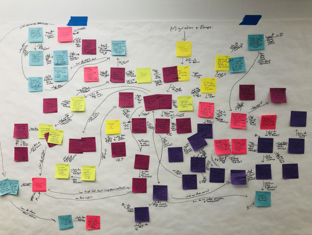
We ended up with about 65 articles, each linked to one or more other pieces of content. The articles are all short – most are between 50 and 250 words of text, though some are simply an interactive chart or a few words and a graph.
Getting out of the way
Sometimes restraint is the hardest part of building a good digital product.
When you’ve got this great idea, you want to spruce it up by throwing a lot of bells and whistles at it. But in this case, the research – or more specifically, the connections between the research findings – is the real star of the story.
We opted for a design that keeps the content front-and-center, and we did a fair amount of work under the hood to ensure that transitions between screens remain seamless.
On the virtues of content strategy
Think tanks are in the business of knowledge and evidence. But knowledge and evidence aren’t concrete things. They’re abstractions floating around in the ether. I can know something or have evidence for it, but until I share that through discourse or publication (and the modern world provides countless opportunities for discourse and publication) the knowledge or evidence is useless.
Part of our job as communicators is to mold those abstractions into some sort of concrete form, whether that be a video or an infographic or a straight research report. In this way, we turn knowledge into progress.
When we do our jobs well, the form we choose will cue our audience to certain behaviors, whether that be supporting a specific policy or adopting a specific frame in thinking about a topic.
A research report probably isn’t the right form most of the time. But a nonlinear, choose-your-own-adventure toolkit won’t be right most of the time, either.
The key is investing in the time and effort to marry the right form to the content. REMINDER dedicated around 20% of its budget to content strategy and design, then invested about 80% of staff time into writing, editing and approving the 60+ articles in the toolkit. That’s an 80/20 rule we might do well to copy in future.
Not every project will – or should – look like this one. But if you’re serious about putting the right content in the right format in front of the right people, then you may want to consider making a serious investment in your content strategy before jumping straight into products.