I’ve written before that think tanks exist to turn evidence and ideas into social progress. As we saw in part 1 of this two part series, a vital component of that is having a brand which speaks to all of a think tank’s different audiences – and the primary way that you will reach these audiences these days is digitally.
Clearly, digital channels open the way for think tanks to reach wider and more diverse audiences. And at Soapbox we believe that our clients have a duty not just to make policy research more accessible, but to actually enter into a dialogue with those who make, implement and benefit from evidence-based policy, about designing the kind of public services we need and the kind of society we collectively want to build.
The question is, how exactly do we reach these audiences, and, more importantly, what conversation do we want to have with them once we have reached them?
Our branding work for SEI was based on a digital communications strategy that we co-produced alongside the organisation. The research suggested that SEI needed a new digital-first visual identity, new types of digital content and a new platform to house that content in order to best engage with and grow their audiences. The next step, therefore, was to build a website which would become a tool for making SEI’s communications revolution a reality.
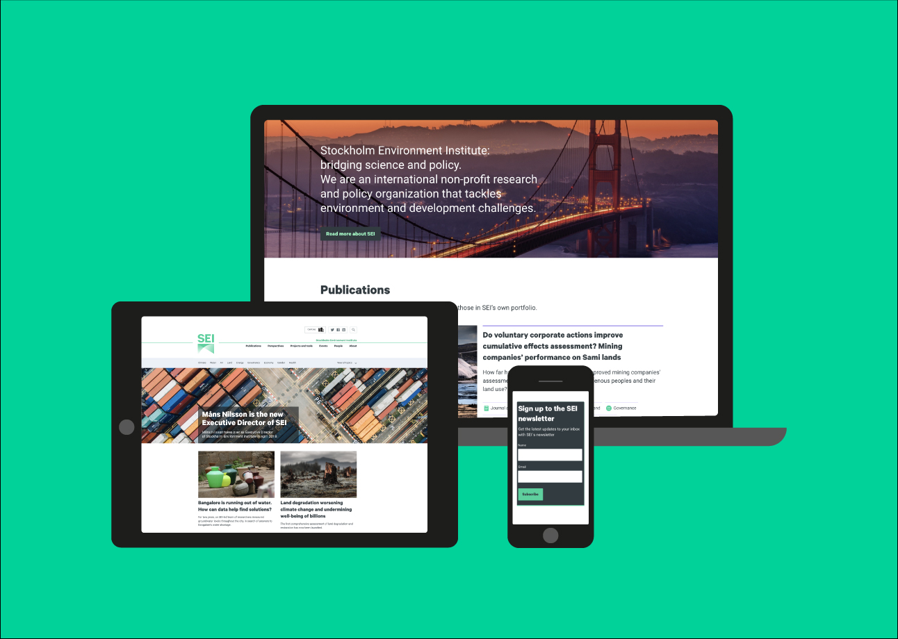
The modern think tank website
The days when a think tank website acted purely as a library for PDF reports are long gone. The modern think tank website needs to support a wealth of activity: live-streaming events; responding to breaking news; acting as a hub to connect people with researchers; creating project pages that are almost microsites in their own right; and, yes, still publishing reports.
Generally though, these reports are also now published as summaries: short-form content that is supported by infographics and videos, and followed up with blog posts and key findings pushed out across other digital channels (such as social media). Reports are also increasingly reproduced in full online, making them more accessible, shareable and searchable, and consequently greatly increasing their readership. This approach can be seen, for example, in the online HTML ‘readers’ we have developed for clients such as Chatham House and the Health Foundation.
So, with this in mind, when we built the new SEI website we had three main aims:
- The site should present information at different levels for different audiences in ways that are easy for every user to discover;
- The site should take users on a journey to greater engagement;
- The site should make it easy for both internal and external users to share content across major digital channels and platforms.
Stage 1: Discovery
When developing SEI’s digital communications strategy, we had already done some user research and drafted user journeys (how typical users might navigate and interact with the site). We were able to reuse much of this work when we came to build the website, but Moa Engström, SEI’s new Head of Digital (and later Head of Corporate Communications), challenged us to be more specific in the questions we were asking and in showing how this discovery work would translate into realistic performance indicators for their new site.
So a fresh questionnaire was produced and a fresh round of user interviews undertaken to generate more specific data. We also performed a competitor analysis against the existing websites of some of the world’s leading international development think tanks.
Some key findings from this research, applicable to many think tanks, include:
- Email newsletters are a big driver of traffic to think tanks websites. Making sure they are relevant, well designed and well structured can greatly increase traffic. Driving sign-ups to this newsletter should be built into the fabric of the site at multiple levels.
- Events are increasingly popular with many different types of user – both live events and their subsequent archives. Events can be used to generate vox pops, summaries, slide decks and other materials that often have a long shelf life. Events are also prime opportunities to expand your social media reach.
- People want to engage with people. I’ve written before about how think tank researchers are providing a service to those who have a stake in better public policy. Our interviews show that users are curious about the people behind the research. They want to know about their background, their other work, their commentary and social media activity, and how they can engage with them to find out more about their unique perspective.
- Users want to see long-form research or at least know that it exists. The way they choose to consume it – print, PDF or long-form HTML – is a matter of individual preference. Publishing your research and recommendations in full is not really a matter of mass communication (clearly we have superior tools for that). It is a matter of transparency, intellectual integrity and your duty to the researchers and policy professionals who come after you. It speaks to the credibility of your organisation and is expected by think tank audiences of all kinds.
The end result of our discovery process was a strategic brief which set out detailed organisational and user goals for the website that we could use to test our subsequent work. In summary, these were:
- To enhance SEI’s brand perception and present the organization to its target audiences as key international stakeholder in the field of sustainable development with a substantial presence in multiple countries around the world.
- To provide a high-performing online home for SEI’s thought leadership on environmental and development issues, and a communication hub for all of SEI’s research, capacity and policy.
- To promote effective touch points and dialogue between SEI’s experts, and the target audiences.
- To offer users a compelling, intuitive and interactive online experience, with multiple ways to access and engage with SEI content.
Stage 2: Information architecture
A clear content structure that allows users to find content intuitively is absolutely vital to the success of any think tank website. Internal systems of classification and the use of jargon will inevitably lead to low traffic and, consequently, low engagement.
For SEI, we started with an audit of the existing site and then compared this to our strategic brief to see how it could be improved. Broadly, when we try to organise a think tank’s online content we are interested in four things:
- What types of content are there? For example: publications, events, people, blog posts.
- What are the characteristics of each content type? For example, events often have a date, time, location, title, description, speakers and so on.
- How are content types categorised? For example, by topic, by location or by date.
- What page templates and components will we arrange the content into? For example, a topic landing page might pull through listings information about publications, events and people associated with that topic, but it will often also have its own title, blurb and often curated highlights.
SEI was formed in 1989, has offices in ten locations worldwide and employs around 250 staff. In any organisation of this size, age and complexity there will be differences among the staff about which content is most important and how it is best classified. So any database of this content needs to be built in a flexible, future-proof way. Nevertheless, at some point you have to get to grips with this enormous volume of work and organise it in a way that makes sense (and that you can test with users).
Arriving at a solution to this is often the hardest part of any website design process. It takes a mixture of consultation and leadership, and requires strong willpower within the organisation to champion good decision-making.
To kick this process off, we held a workshop and card sorting exercise with SEI’s project team to look at alternative ways of organising the content. From the workshop a draft site map was created and this went through a number of amends as Moa and the wider SEI communications team worked hard to forge a consensus within the organisation. They were able to use the external user research to cut through inward-looking ways of classifying the content.
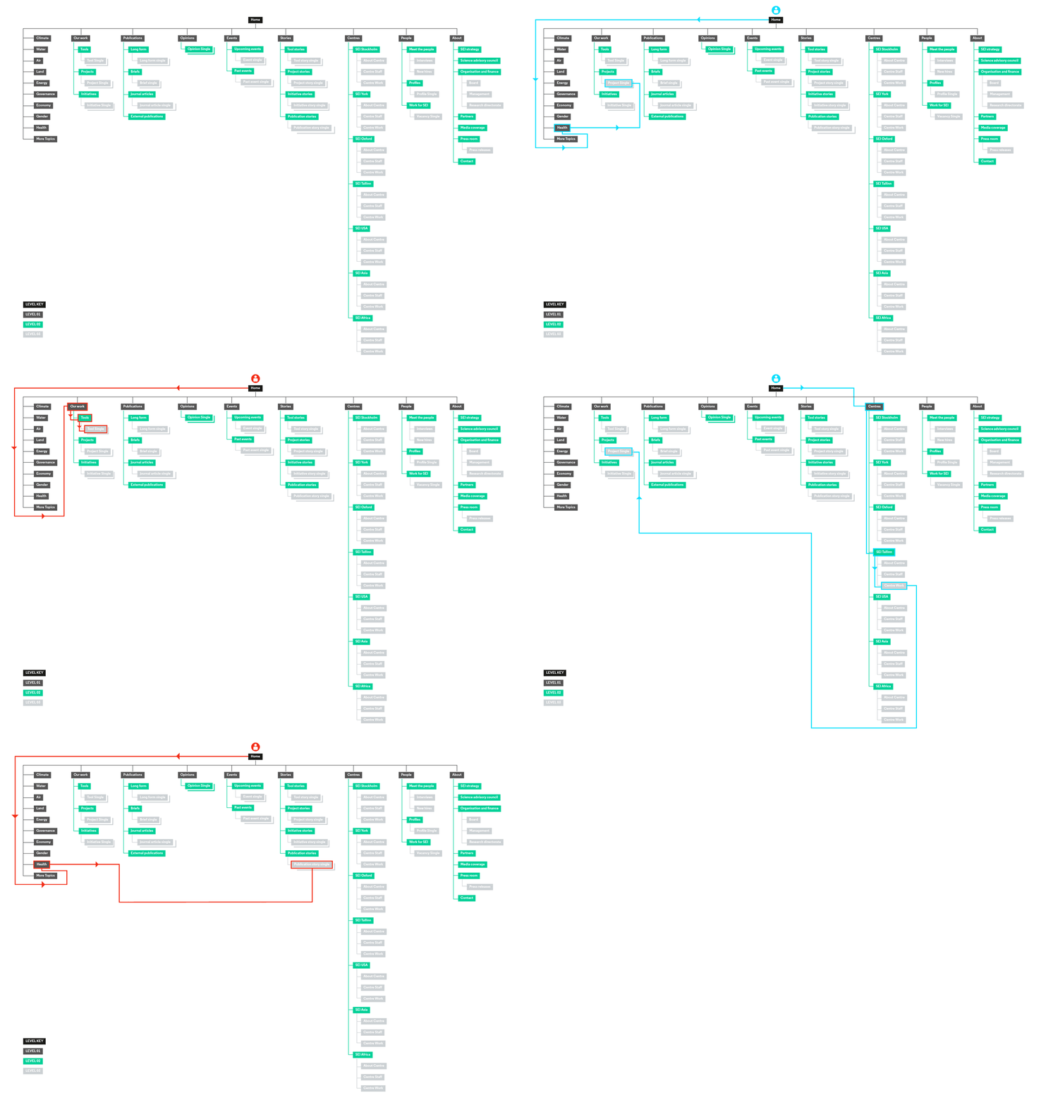
Stage 3: Wireframes and visual design
Wireframes are diagrams that show the placement of content and page elements representing the overall structure of the website. This is the stage at which websites really start to take shape from a client’s point of view.
In component-based websites like SEI’s, different page elements – for example text blocks, calls to action, full width images and so on – stack on top of each other in any order the website editor so chooses. This means that you can build very different looking pages from the same template by using the library of components in a different order.
This approach works well for think tanks, who often have a large volume of diverse content which they want to display in flexible ways. It also makes the site better value for money and more future proof, because we can design and build new components more cheaply and quickly than new whole-page templates.
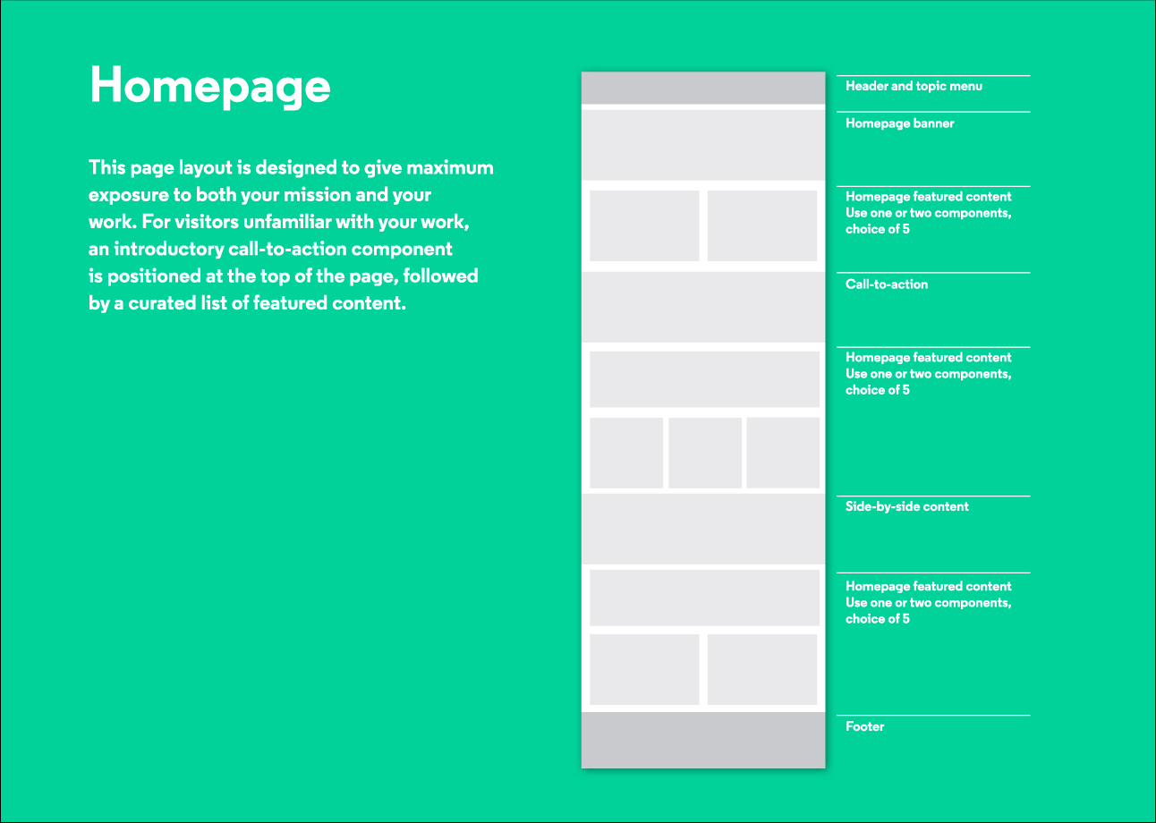
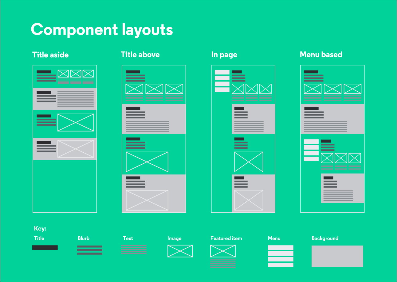
Moa challenged us when designing the wireframes to give SEI a greater range for flexible components for displaying featured content. She felt our initial selection was too limiting and offered the example of the Guardian as a site with multiple options for featured content. We initially resisted this, feeling that the pages needed to be more structured to give users a sense of where they were in the site. but Moa’s approach turned out to be absolutely the right one, allowing the SEI site to feel more active and behave more like a news site than a library of projects and papers. This, in turn, encourages users to read and interact with the site as if it were a news site, leading to longer, richer user interactions – exactly the effect we were aiming for.
We tested the wireframes by setting users various tasks on a clickable model of the site and seeing whether it was clear to them how to find different types of content. This allowed us to validate and amend our work to create a final set of wireframes covering desktop, tablet and mobile versions.
Once the wireframes were signed off, visual design turned out to be the easiest stage of the process on this project. Testing had shown that our UX work was sound and the visual identity had been signed off well in advance, so we had plenty of time to think about how we wanted the site to look.
Moa and her team were immediately delighted with our overall designs and they offered detailed feedback as we refined them across the page templates and components.
Stage 4: Development
One of the most crucial aspects in web development is the choice of content management system (CMS) – the engine behind the website.
Drupal was the CMS of choice for larger think tank websites for a number of years. It is safe, solid, copes well with big volumes of content and is supported by many different web firms – nobody’s ever been sacked for choosing Drupal! But it is big and bulky to deploy, more expensive to maintain and has a poor back-end user interface.
Our recommendation for SEI’s new website was Bolt: an open source alternative which overcomes the problems that affect Drupal and still copes well with a large volume of content. But, being a relative newcomer, it is less well supported by other firms – Soapbox is currently one of the leading Bolt developers.
To our amazement, Moa and her team, instead chose to develop the site in WordPress, a CMS usually associated with smaller sites. Once we overcame our initial shock we were excited to take up the challenge. WordPress (which also powers On Think Tanks) is extremely well supported by the development community and a dream for web editors and developers to use.
Other web agencies and bigger think tank clients often look at me as if I am crazy when I tell them SEI is a WordPress site. But sei.org is lighting fast, works well in low-bandwidth areas, is very easy to maintain and edit, holds a huge volume of content, is great for SEO and is very secure. After our work on the site, the SEI communications team received a free consultation from Google who confirmed that the site is well coded and performs well.
We learned an interesting lesson, and we can now say that SEI were right to go against our recommendation and choose WordPress. Although Soapbox still supports Drupal sites, and we will continue to develop some new sites in Bolt, our experience with SEI has made us double down on WordPress as the CMS of choice for many clients going forward.
Next steps
Think tanks are going through a digital revolution. They are starting to produce content in a digitally-native way and building better websites, mailing lists and social media accounts to house and disseminate that content.
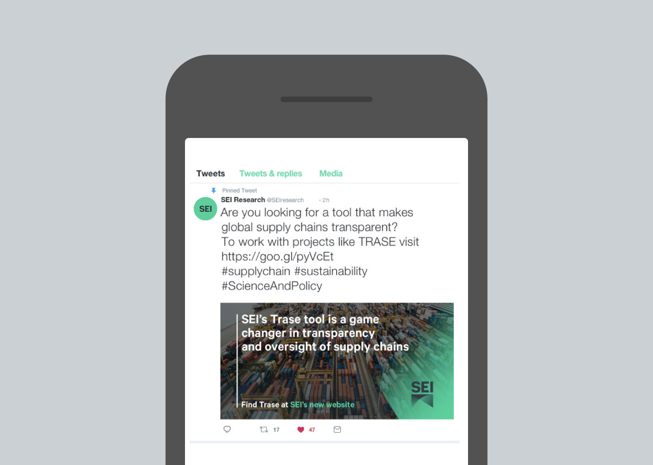
We launched the SEI brand and site with a digital marketing campaign orchestrated by On Think Tank’s own Jeff Knezovich.+ During the campaign, traffic to the SEI website increased ten-fold – a feat which Jeff achieved using an advertising spend roughly equivalent to the cost of designing, proofreading and printing a sixty page research report.
So we are learning how to produce and distribute content which will funnel wider and more diverse audiences to think tank websites. The next question for think tanks – and one Soapbox will be working on in the coming years – is what do we want to do with these audiences once we have their attention? How do we keep them engaged, deepen their knowledge and, ultimately, work with them to design better public policy?
As Moa Engström puts it: “In recent years, digital marketing techniques have not often been used efficiently enough in the area of public policy. At SEI we want to reverse that trend, working with Soapbox and others to use digital communications in more targeted and analytical ways. We want to use our digital platforms to engage with our audiences to increase impact and play a leading role in improving the integration and uptake of evidence in policy making.”

