

 Previous

[ Sonia Jalfin, from Sociopúblico, shares the experience of building a new website for Argentine think tank CIPPEC, step by step.]
I recently saw a presentation by Vox Media director Lauren Rabaino that started like this:
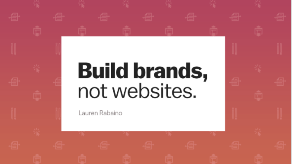
Lauren’s argument went something like this:
Our audience is on social media networks. They talk about the topics that interest them. If we want them to listen to us, we have to create brands that produce relevant content that works well on those sites. Let’s create brands and content – not websites.
You’re right, Lauren.
Websites are in danger of extinction. Our content is live, more and more so, on social media. Websites are, increasingly, repositories where we store all our content in case someone wants to go looking for it. They are our archives and, for that very reason, we can’t live without them. Their role is similar to that of our “home”, where we welcome those people who really want to get to know us.
At Sociopúblico we love making websites. We’re all about communicating complex ideas, which requires us to leverage all channels and resources. When CIPPEC, one of Latin America’s leading think tanks, asked us to redesign their website we got excited just thinking about all the possible ways to go about it.
In this post we share the process we went through together in five useful steps to create your own living dinosaur.
1. Hello, audience!
Like good paleontologists, the first thing we did was check out the terrain. In the case of CIPPEC, we tasked ourselves with really getting to know their needs, how they operate and familiarising ourselves with their communications strategy. But it wasn’t just about getting to know them- we had to get to know their audience.
With this in mind, we did in-depth interviews with the users of the site we were about to redesign. This step is often left out due to lack of time or budget, but it is the most important part of the process. It doesn’t take much time either. In the case of CIPPEC, we did ten 30-minute interviews. These were the most useful five hours of the entire process.
Working on a user-centred strategy seems simple, but it’s often the most difficult. As members of a think tank, we might think we already know everything there is to know about our institution and our audience. As communications professionals, it might be hard for us to pass the microphone to users who know nothing about design or development. But talking to real users can tear down some of our assumptions, provide us with new ideas and, above all, help us build a useful product.
Thanks to the interviews, we were able to define what in the field of user experience is called the “user persona” (or just “persona”):
A user persona is a representation of the characteristics, abilities, objectives and attitudes of a hypothetical user.
Through the interviews, we tried to understand what users do and need when they visit CIPPEC’s website. Three things to keep in mind at this stage are:
- Ensure that your questions don’t lead to a specific response: it’s better to let users explain what they do on the site, what interests them or what they find awkward, without leading the conversation too much.
- Try to pin down what they really do and not what they say they do or their opinion about the design.
- Pay attention to specific words they use to describe sections or content. You want your site to speak the same language.
CIPPEC’s interviews allowed us to see that we had two major types of user personas:

On the one hand, we have the specialists: researchers, academics, political advisors or journalists in the process of writing an article. They all find reference sources relevant to their fields at CIPPEC and they mainly consume publications or reports. Specialists generally arrive at the site knowing what they’re looking for. They have specific objectives: they are after one issue or particular piece of data. They are very familiar with the organisation’s profile.
On the other hand, we have the generalists. These are donor institutions (business people, executives), colleagues from other organisations working on communications, administration or institutional development, journalists looking for new pitches, and the wider community of people with an interest in public policy who may not follow an issue in detail but have an occasional interest. They all prioritise synthetic content, videos and infographics. They usually come to the site to find out what the institution is generally doing, rather than to look for a particular issue.
Through the user interviews, we learned some very useful things. For starters:
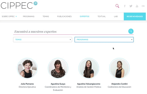
- The section “About us” or “Team” doesn’t only act as an introduction, it also has a strong social dimension. Expert users are interested in following their colleagues’ professional paths, knowing if they switch areas or if they join a new project. For this reason, we decided to include access to the experts along with each type of content: in the publications section, the thematic areas, and also in a new experts section.
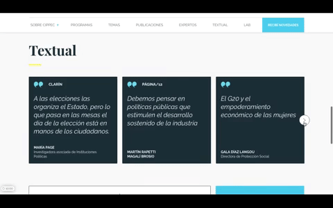
- Generalist users want to know what other members of the institution think about major issues. They often use that information for conversation in work meetings or social situations. This is why we created the Word-for-Word section, which compiles opinions posted on blogs or in the media.
2. Flow with the user
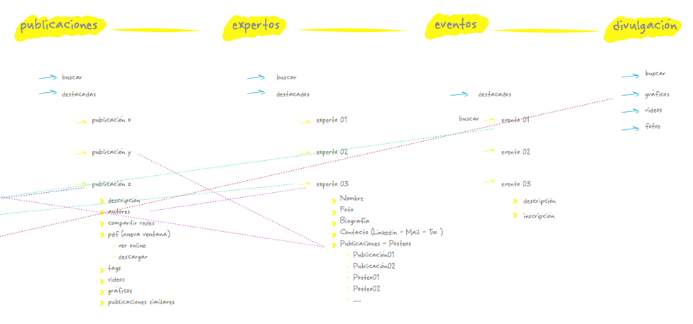
We’ve already gotten to know our users. The second step is helping them navigate the site and meet their objectives as simply as possible. To accomplish this, we built a flow chart with all the information we were going to offer and the paths users will take to navigate it. This is the site flow.
The interviews taught us that there are many ways to get to the same information. Some users prefer starting their exploration by topic. Other users already know which CIPPEC area works with certain issues and prefer to start there. And other users search content based on a recognised expert. For this reason, we came up with a modular structure. Each piece of content has several tags: it belongs to a subject, an institutional area, one or more experts, and a type of content (video, publication, charts, etc.). This allows the search feature and filters to bring up all the information users need. Once we made sure this was in place, we put the search feature in every section or segment where users might need it.
This is how our content tree and flow turned out. It is a map of the paths taken by users.
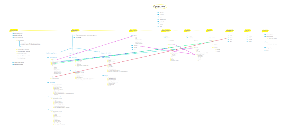
And this is an approach to some of the internal sections:
Creating a flow forced us to think about the past and the future.
- About the past: Throughout its history, CIPPEC has developed a number of microsites for specific projects, partly because its previous website didn’t have the flexibility to address the needs of those specific projects. At this stage, we evaluated each of them and decided which ones to keep based on their traffic and how current they are.
- About the future: We envisioned a structure of flexible post-types that would allow for the creation of new project pages without having to build an external site. Although users told us they still prefer PDFs to read long texts, we created a model ready to generate purely digital publications, with the possibility of embedding highlights, videos, content from social media and interactive charts.
3. Wireframes and design
With the general overview of the outline, we could start laying out each page. A wireframe is like an architectural blueprint for a website: it defines what you see, how big it is, in what order and where. Nothing else. For now, there are no colours or definition of fonts or styles.
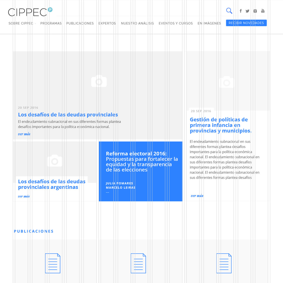
CIPPEC needed flexibility to publish its content, so we created a very versatile grid of 15 columns. The grid lets us build smaller modules of two or three columns each, for small citations or a side-column, as well as modules that occupy the entire screen and ones that require a key highlight or a publication header.
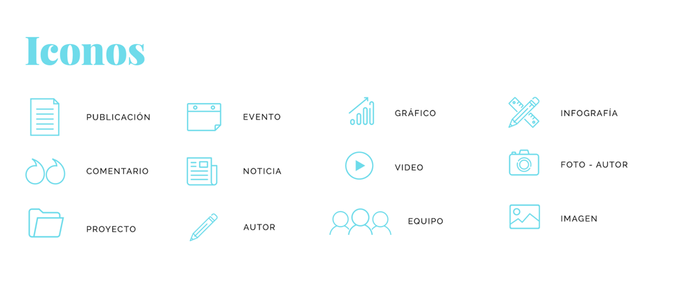
Once we got past the debate stage and set parameters for content and structure, it was time to worry about visual design and aesthetics. The first step was to establish a style guide to define the colour palette, button styles, iconography and fonts (for titles, paragraphs, highlights, etc.).
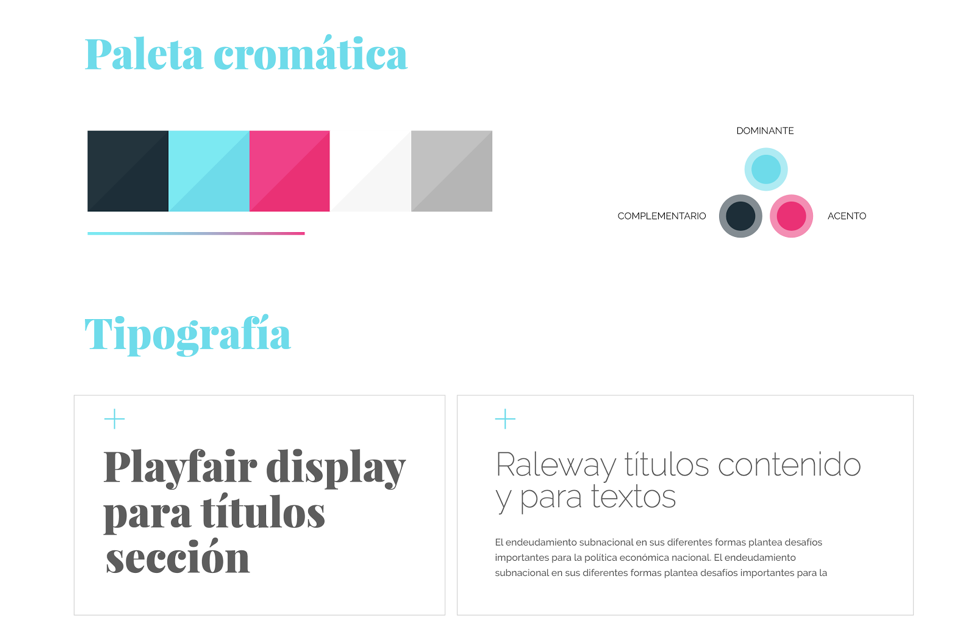
The interactive elements don’t have a single appearance: we had to think about how they look in different situations and design each of their iterations. For instance, a button can change colour when the cursor is over it and change again with a click of the mouse. This may seem like a minor detail, but it is essential for communication with the user. We need to let them know that the button is clickable, that the page is loading, that we received their form, etc.
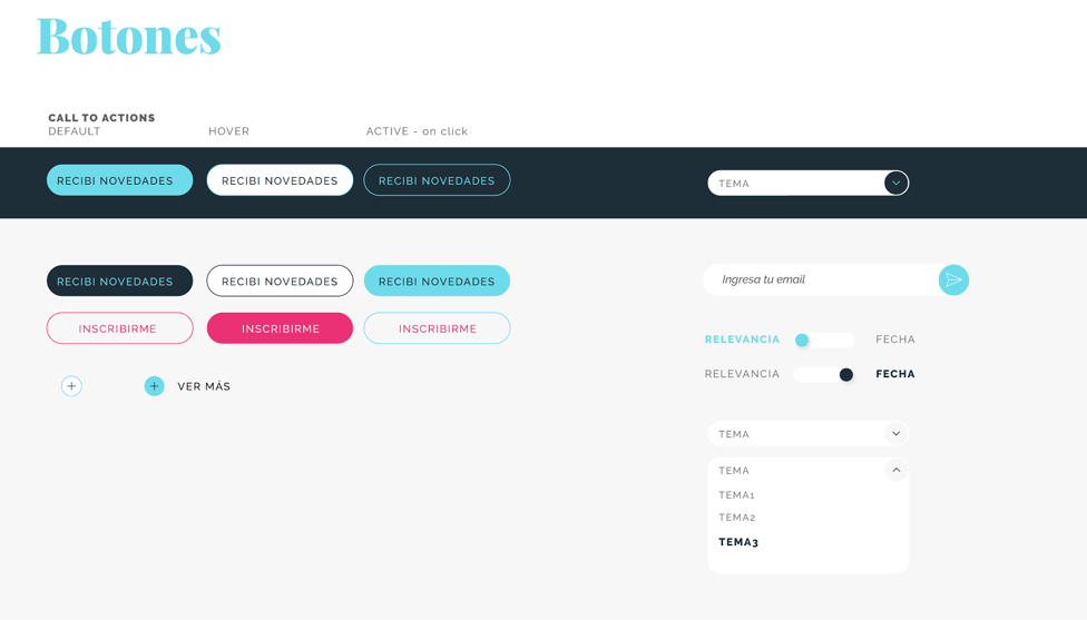
The style guide is a fundamental first step to ease the process of designing each screen. CIPPEC’s institutional colours were adapted to respond to an online environment without losing the institution’s visual identity. Specific icons were designed to reflect the variety of content and two very sleek classic fonts were chosen.
4. Layout and implementation
After all the planning, the time has come to make it a reality: layout and implementation. We chose WordPress as CMS due to its versatility and ease of use. Like everything in this process, we adapted it to fit CIPPEC’s specific needs. For instance, title styles have a maximum number of characters enabled from the system, because CIPPEC’s team wanted to avoid the temptation to use unnecessarily long titles.
We also adapted the content administrator. We thought about the people on the communications team just as carefully as we did about the end user, because they are interact with the site on a daily and their work is key. We used titles and intuitive indicators everywhere, and enabled functions that facilitate content-uploading: drag and drop for organising posts, selection of drop-down menus for choosing tags, etc.
Before finishing the job we went back to the start: testing it with users again, but this time with the new site nearly done. This allowed us to verify how the design was working and what adjustments were needed.+
This brought us to the final step in development before launching. This is the favorite step for obsessive people like us: quality control (or QA). This is basically about clicking on everything, reviewing the site on phones, tablets and different browsers: navigating like a beginner and covering all possible paths to find errors and things to improve. We have to be meticulous about this and pay close attention to detail. After this, the site goes live and we don’t want users to find those mistakes or glitches and ruin their experience.
5. Going online and loading content
All of CIPPEC’s previous publications were migrated automatically. We had to resolve a few specific issues for the tags on those old publications to work properly. For instance, some of those tags belonged to institutional areas that no longer existed.
The new content – such as new events and updates – were manually uploaded over two weeks on a testing site. This allowed CIPPEC’s communications team to learn how to use the content administrator while still in constant contact with us before stepping into the ring. And then we did it: we went live!
Now what?
Websites, like dinosaurs, leave behind a deep footprint. When they change, they generate change all around them.
Sebastián Zírpolo, CIPPEC’s communications director, says,
Since we launched the new site, the internal culture of the institution has changed. Everyone’s taking more interest in communicating what we do, asking us to improve their photos and bios. They seem to care more about their content being online.”
CIPPEC has also recently launched a communications campaign with us in view of the upcoming legislative elections in Argentina, which began on social media networks and then continued on the new website with a series of integrated contents. You can visit it here and tell us what you think!